Transforming Fitness
Year
2021 - 2022
Timeframe
8 months
Category
UI, UX and
Interaction design
The NoiseFit app is India's #1 health and fitness application designed to help users track their fitness activities and monitor various health metrics. It is developed by Noise, a company known for its consumer electronics, particularly smartwatches and fitness bands.
Project objective
The project aimed to enhance usability, increase user engagement, and ensure smooth, efficient app functionality. The primary objectives were:
Understand problems in the current UI.
Create a comprehensive list for the revamp.
Divide the revamp into phases based on importance and urgency.
Restructure the architecture to ensure fast app performance.
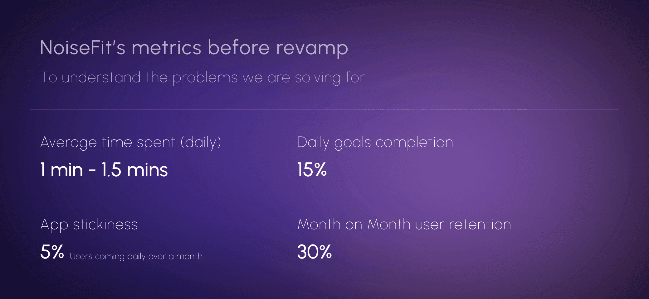
Before starting with the new UI design, it is crucial to understand the current metrics and study the old application to identify the problems necessitating the revamp.
Role as a main designer:
Extended beyond research and design per Product Requirement Documents (PRD).
Actively worked on PRDs, identifying problems and ideating optimal solutions.
Collaborated closely with the development team to understand app architecture.
Created a solid framework for smoother, more efficient app development.
Identified problems


Other market players
Before starting the design and ideating we did a research of what other market players were doing and tabulated a list of features and experience that was present in their application.
Key takeaways
Apple Fitness:
Strong in all areas, offering smooth device pairing, engaging micro animations, challenges, and seamless health metrics integration.Nike Run Club:
Strong in workout details and social features but lacks device pairing and health metrics focus.Strava:
Excels in social features but could benefit from more user engagement elements and health metrics focus.Fitbit:
A well-rounded app with strong health metrics and device pairing but lacks micro animations for engagement.Garmin Connect:
Similar to Fitbit, excels in health and workout details but could improve on animation and interaction.
Ideating and designing
After understanding the problems, we set the course and decided on the phases for the NoiseFit revamp:
Creating a UI guideline.
Revamping the onboarding flow to enhance user experience.
Redesigning the home page with a better navigation for easier and faster browsing.
Improving health metric pages for improved data visualisation.
Enhancing existing engaging features like ‘Challenges’ and ‘Buddies’.
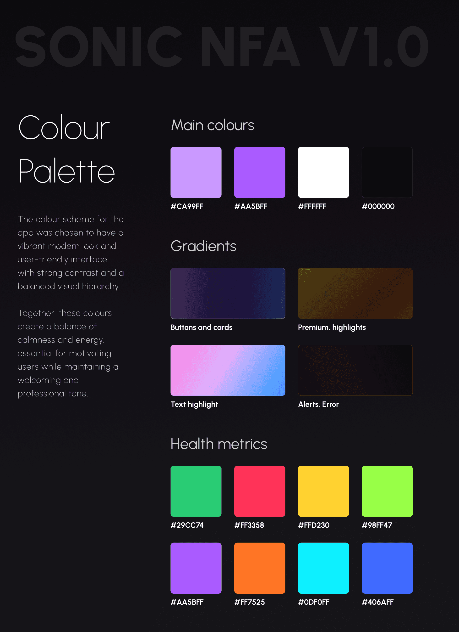
UI guideline
Created a UI system for the NoiseFit app to have consistency
throughout the application.


The onboarding flow
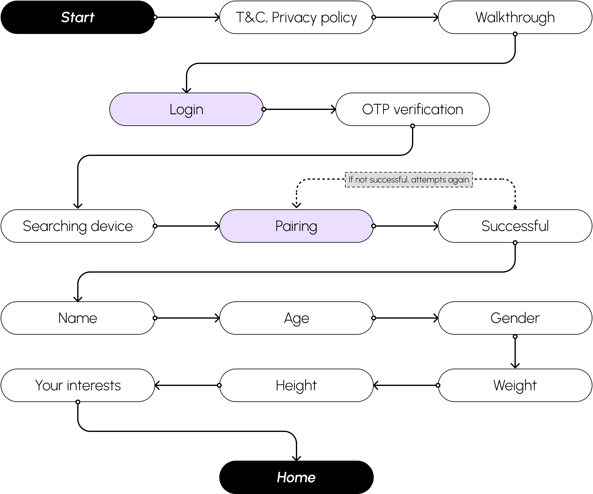
Key improvements

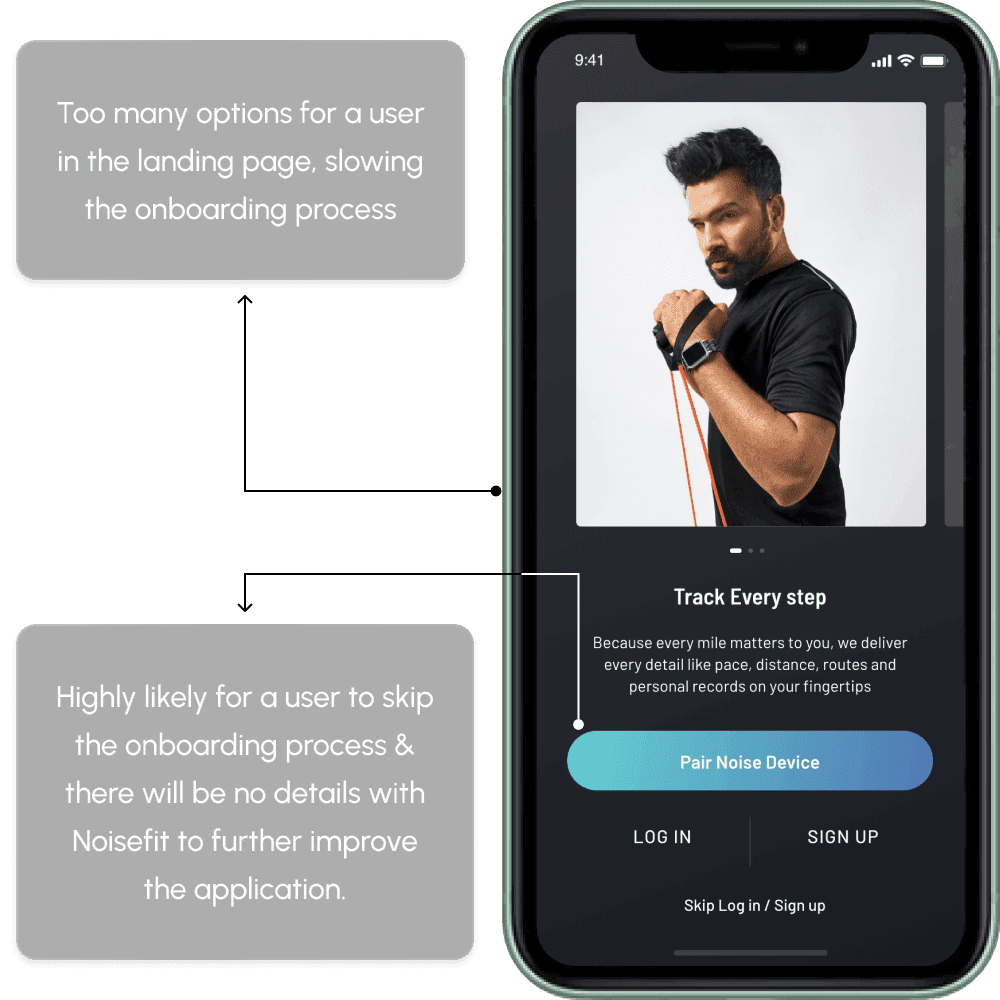
The previous onboarding flow felt like a long form, overwhelming users with too many fields at once.
The revamped flow breaks the process into smaller, manageable steps, making it feel lighter and more intuitive.
Users now experience a guided, step-by-step approach, enhancing ease of use and reducing abandonment rates.


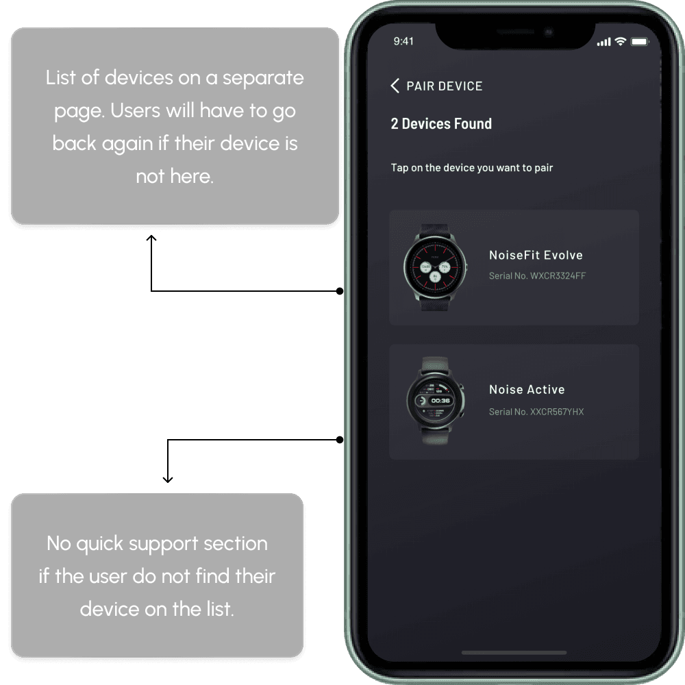
Previously, users had to scan for devices on one screen, then view the list on another. If their device wasn’t found, they had to restart the process, with no help or alternative options available.
The new design combines scanning and device listing on a single screen, eliminating the need to navigate back and forth. A help link is now available for unlisted devices, along with a "Scan QR Code" button, providing users with immediate support and faster connection alternatives.

A new screen with micro animations was added to show the data transfer process before directing users to the dashboard.
It provides reassurance that their data is being successfully processed.
Informative animations create a more engaging and polished user experience, making the app feel smoother and more interactive.


Revamped home page
The landing page of any application significantly influences the user's perception of the app's navigability and usability.

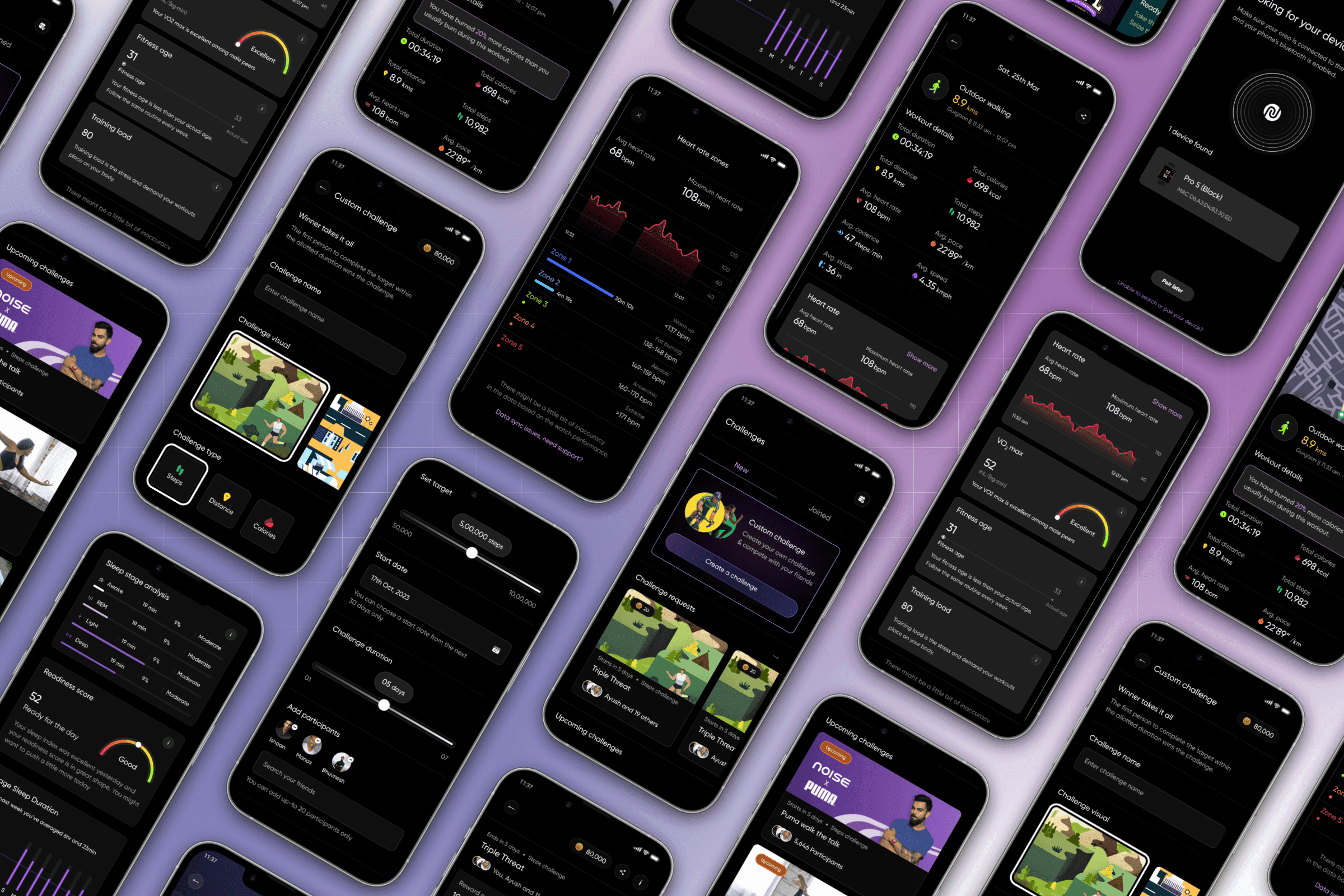
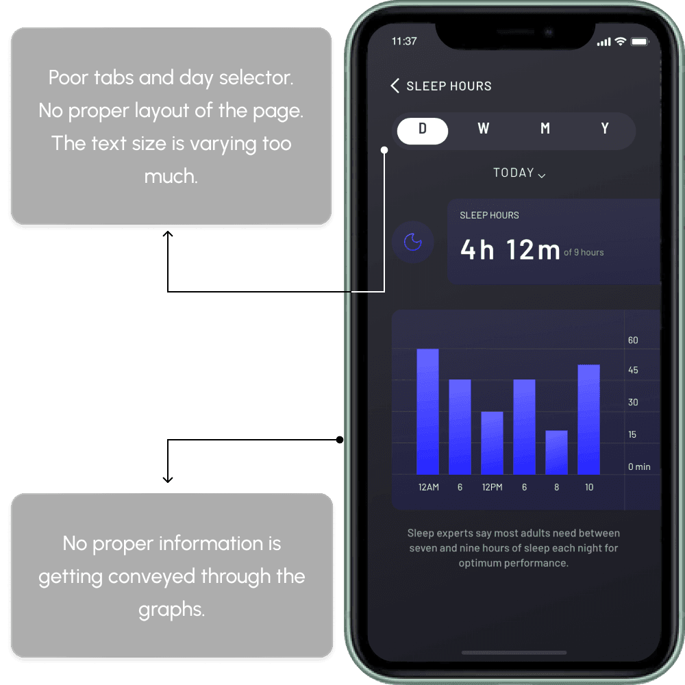
Health metrics
The health metrics detail pages are crucial for any health and fitness app, requiring easy browsing of all data points.

Proper data visualisation for all the important health metrics with better visual hierarchy.


Interactive graphs to help all type of users to understand their heath data at any-point of time with ease.


Made sure to educate the users with informative pages and slide ups in detailed format.
User engagement
For an application to grow, it needs features that encourage user engagement and time spent within the app. NoiseFit already had two such features, but with poor user experience (as mentioned in the "Identified problems").
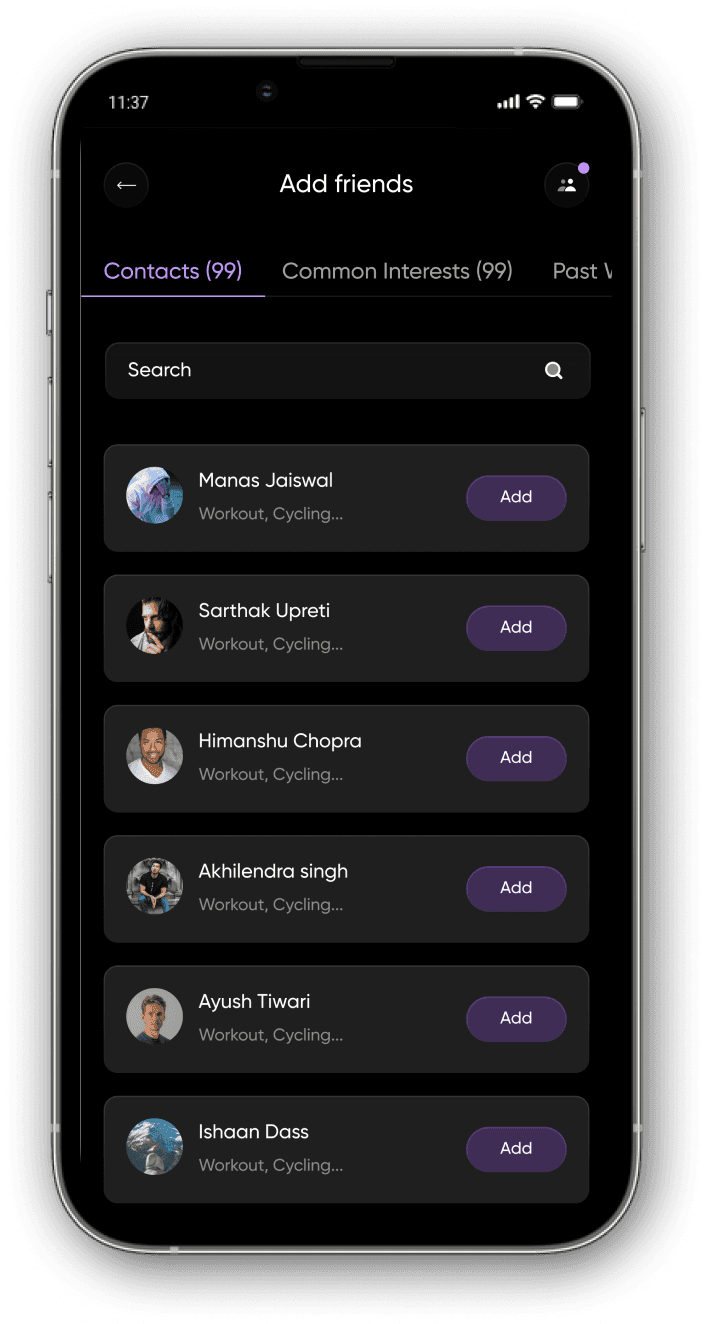

A new enhanced "Buddies" feature, with easy adding of your friends and tracking health data.

Create your own challenges and compete with your friends.

A clear and easy to understand global challenges where you can participate with all the other users.
Creating a beautiful application is one thing, but the real success lies in improved metrics.

The NoiseFit App revamp focused on solving key user experience issues and improving the app’s overall design and functionality. By simplifying the onboarding process, enhancing navigation, improving data visualization, and increasing user engagement, we created a more user-friendly and efficient app. These changes led to a better user experience, stronger brand alignment, and measurable improvements in app performance. The revamp not only addressed immediate problems but also laid the foundation for future growth and scalability.
